Mediboard
The world's clinical trial data made accessible.
Project Overview
Web medical information can be unorganized, unreliable, and difficult to understand. MediBoard solves this problem by comparing medical treatments against conditions using up-to-date clinical trial data. I spearheaded user research & design, developed personas and stories, and redesigned the web and mobile interface.
Role
Design Lead
Timeline
4 Months
Tools
kartSort, Figma
Process
Discovery, Exploration, Testing
The Problem
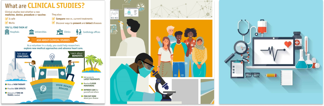
The goal of every medical site is to inform people. However, people need up-to-date and trusted health information so they can make the best health decisions. People need accurate medical information because they become frustrated if they are unable to obtain the right information.
The Solution
We believe implementing a data visualization tool that allows users to get accurate and reliable information will create a pleasant searching experience. We will know this to be true when we see an increase in satisfaction.
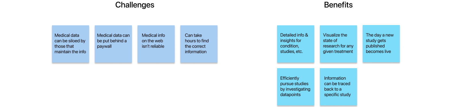
Stakeholder Interview
I conducted an interview with the founder to learn more about the vision and value proposition. From the interview, he identified the challenges with medical information and benefits of his tool/site.
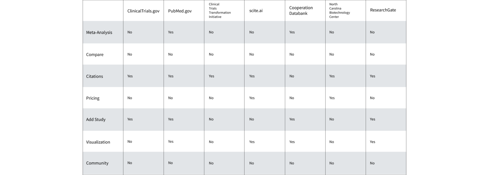
Competitive Analysis
Our team looked into seven other existing medical databases and registries to see how they stay competitive. We discovered many sites did not allow for comparing treaments to see which options were better or enable people to discuss and share their experiences.


User Interviews & Surveys
My team sent out surveys on social media and conducted interviews to understand our audience's feelings and motivations. We discovered that 80% of researcher's time is spent collecting and organizing data. Other concerns include accuracy and excess of information.
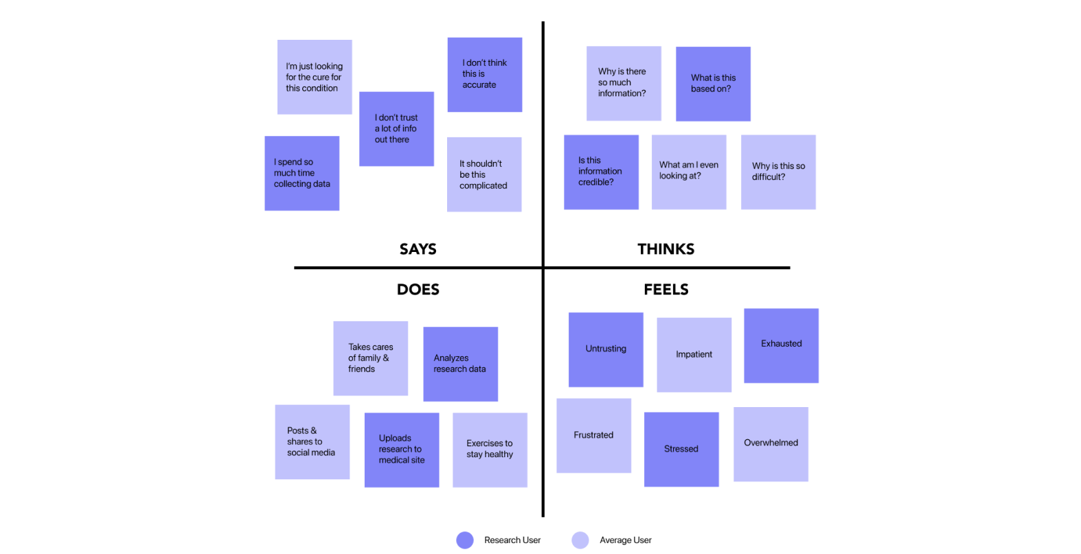
User Empathy Map
Our team created a user empathy map to gain a deeper insight about our audience's needs and pain points. We identified two different types of target users from this exercise.
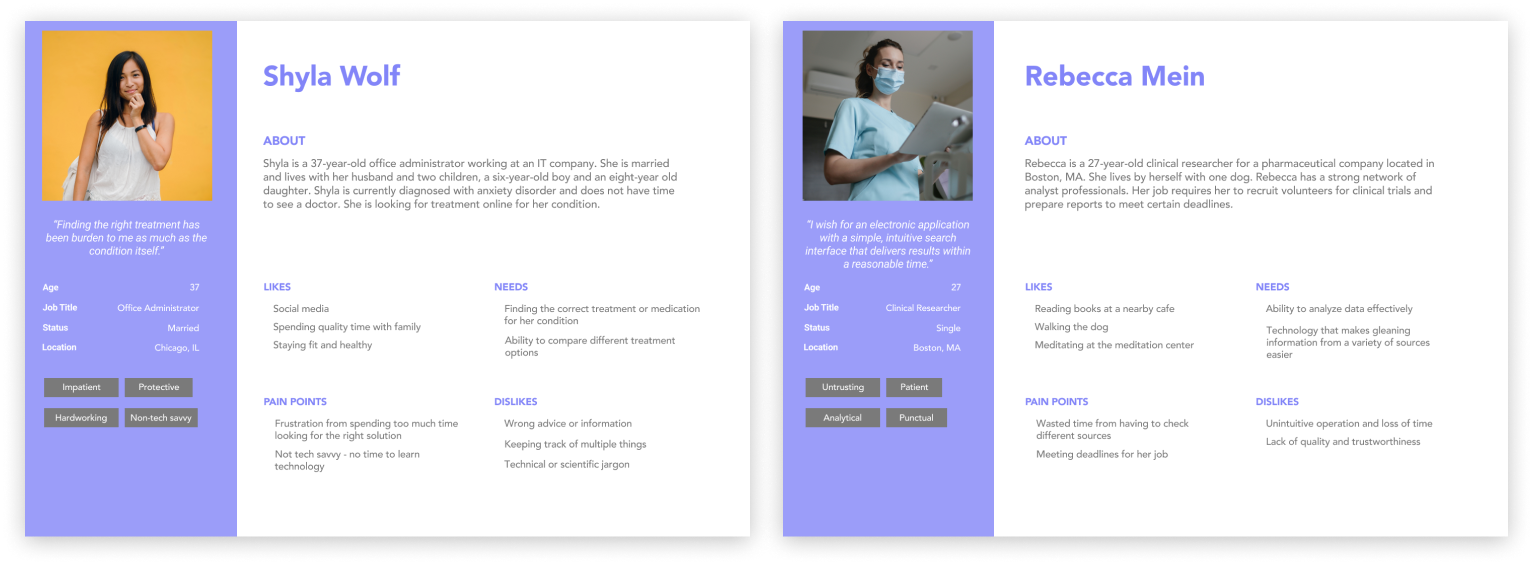
User Personas
We came up with two different personas that encapsulates our model users. Rebecca represents people who use medical data to do their job. Shyla represents the average person looking for the right treatment options for a condition.
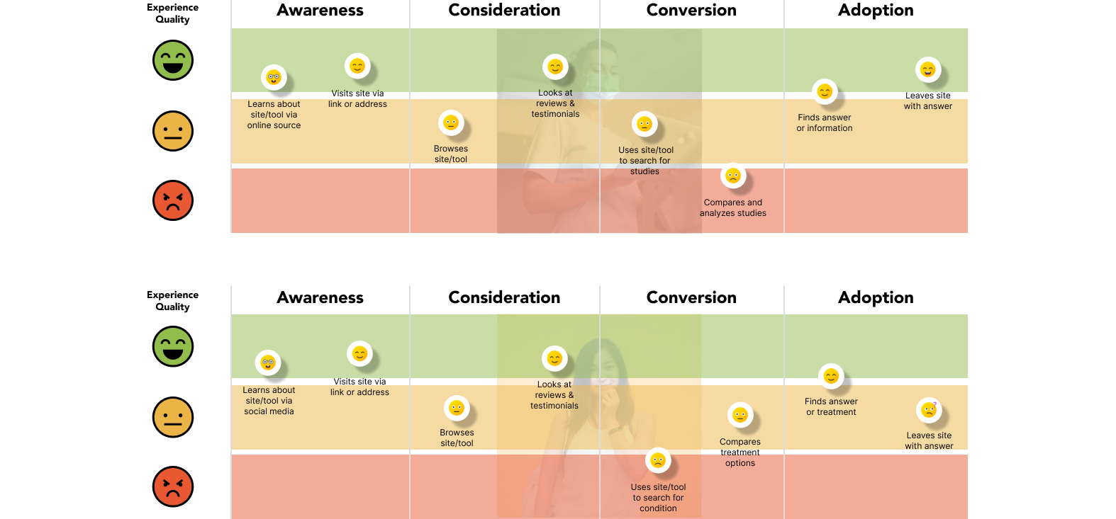
User Journeys
Because both our model users represent two types of people using the site/tool, our team created two different user journeys. The user journey serves to map out both user's anticipated behavior and experience.
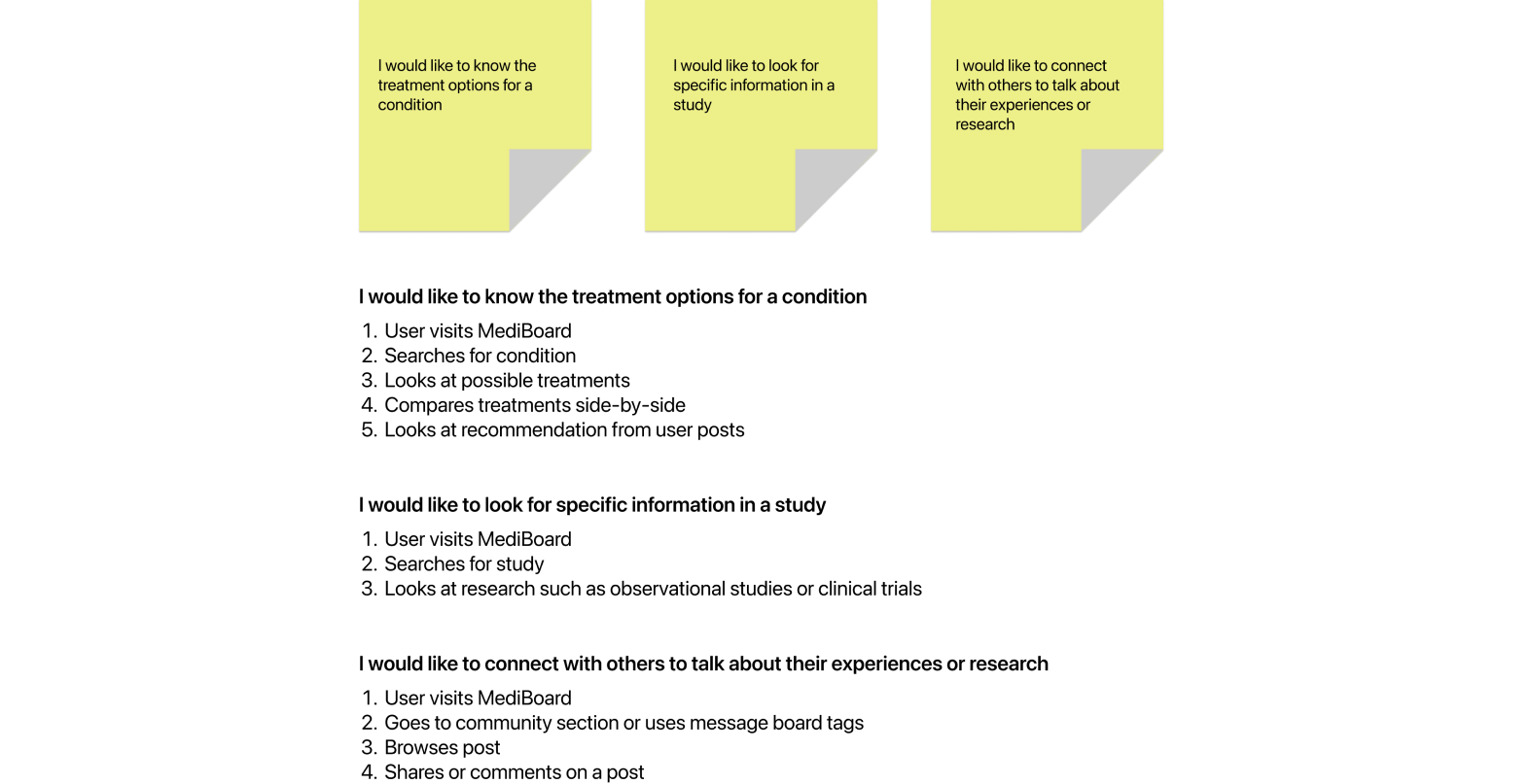
User Stories
My team drafted three different user stories that aligned with the most common responses from the feedback we received. This exercise would help us ideate and arrive at the optimal solution for each problem.
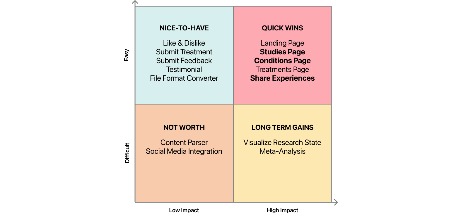
Feature Prioritization
I led a feature prioritization exercise with the team and placed ideas along the chart. Then our team voted on priority features that best satisfied the needs of our user and business.

Information Architecture
Our team created an infomation architecture diagram from our user stories and feature prioritization matrix to define the layout of the site and the general actions for our model users.
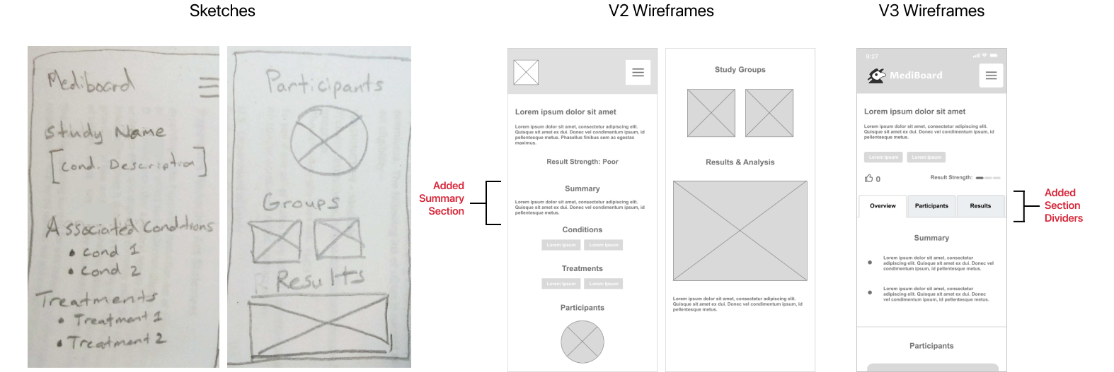
Wireframes
Our team added a quick summary section in our prototype to address concerns of spending too much time. We also added section dividers in the next iteration due to feedback saying there was too much information.
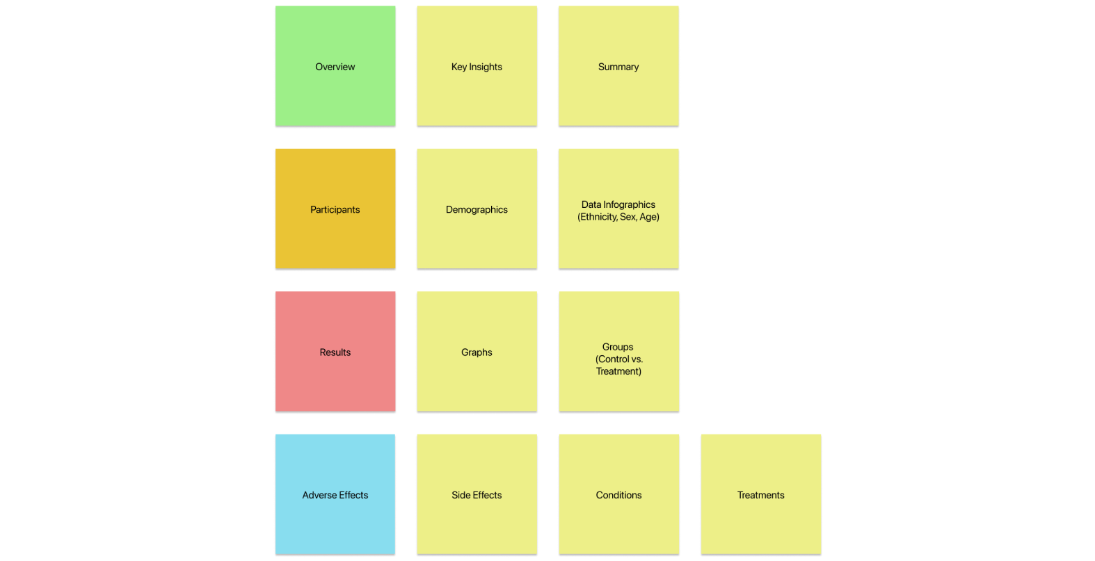
Card Sorting
Our team conducted a card sorting activity to determine how to restructure the content using kardSort. From the ten responses we received, we reorganized the content based on the most popular groupings.
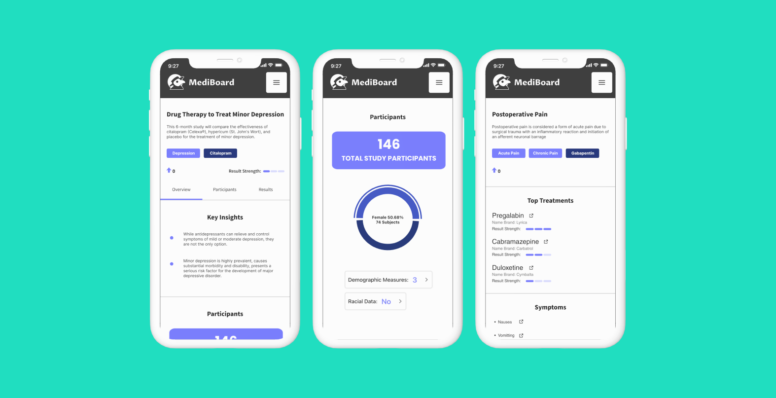
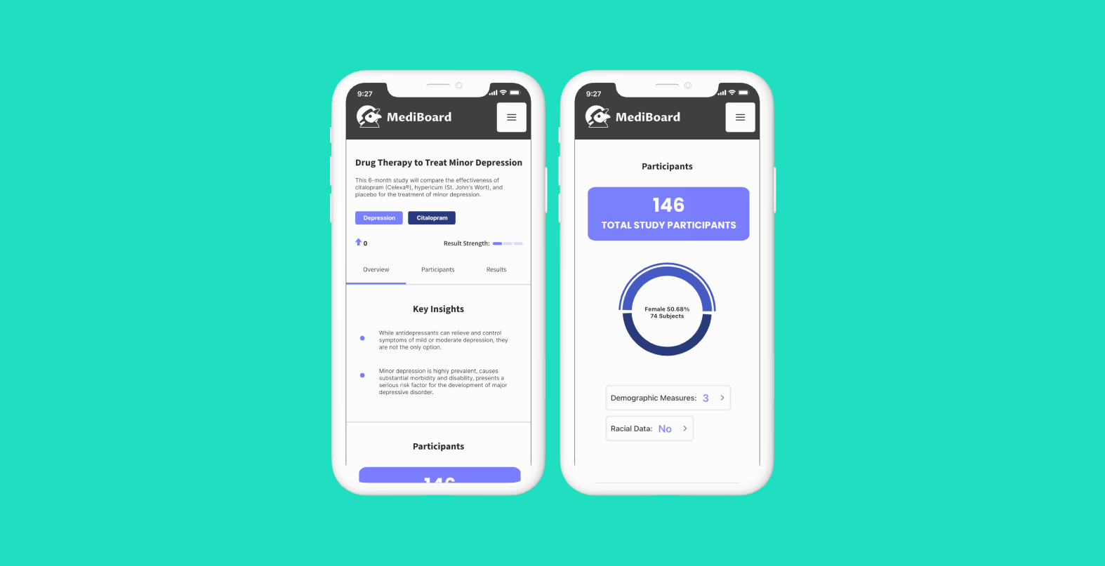
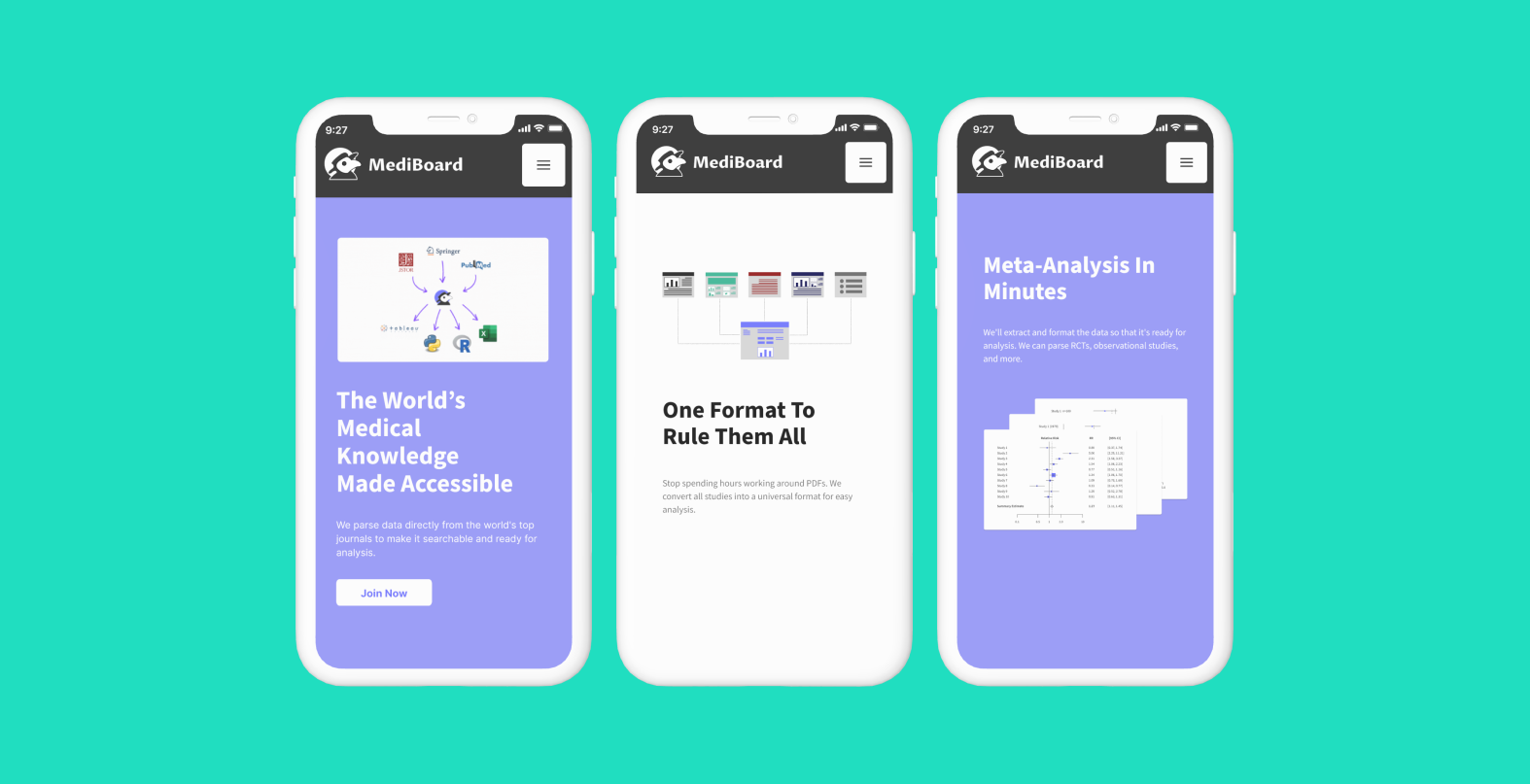
High Fidelity Screens
In the final design iteration, we focused on presentation to make information easier to navigate and digest. All designs and style guide components were based on the design system from fuselab creative.