Hazel Analytics
Data-driven technology solutions to improve food safety and better public health.
Project Overview
Hazel Analytics is a food tech company that offers food safety analytics to restaurants so they can stay compliant with food safety inspections and regulations. My task was to come up with a prototype for the food safety intelligence app.
Role
Interaction Designer
Timeline
3-Week Sprint
Tools
Figma, Zoom
Process
Ideation, Design, Iteration
The Problem
We have observed that independent and small chain restaurant owners juggle between many responsibilities including training & hiring staff, maintaining food safety logs, and keeping track of health inspections.
The Solution
We believe the food safety intelligence app will allow restaurant owners to stay organized and better prepared for health inspections. We will know this to be true when we see that our users are satisifed with the app.
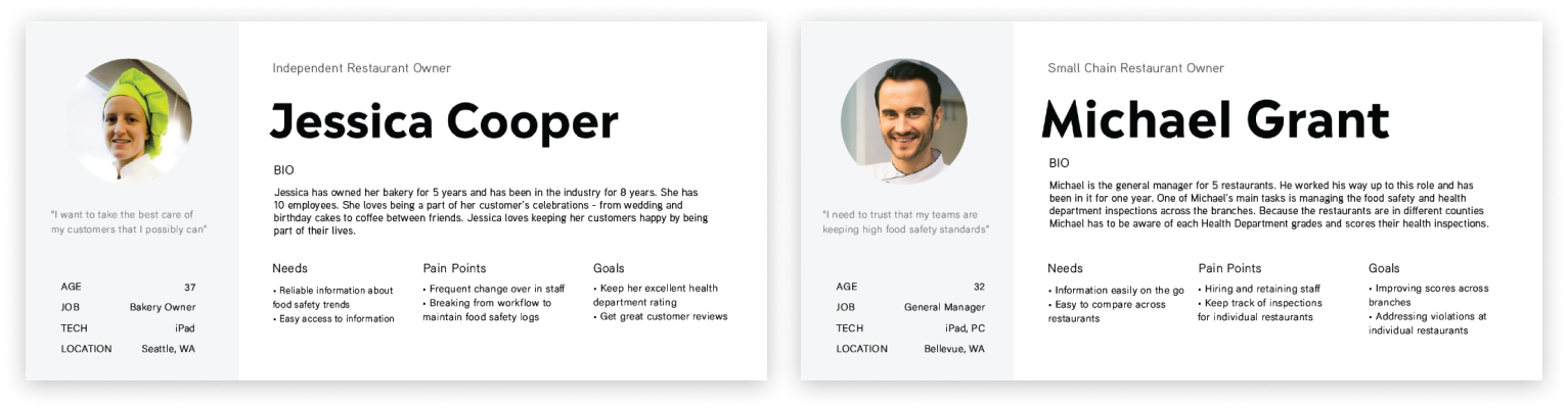
User Personas
Our team came up with two different user personas. Jessica represents the independent restaurant owner while Michael embodies the multi-unit franchisee owner who manages multiple restaurant chains.
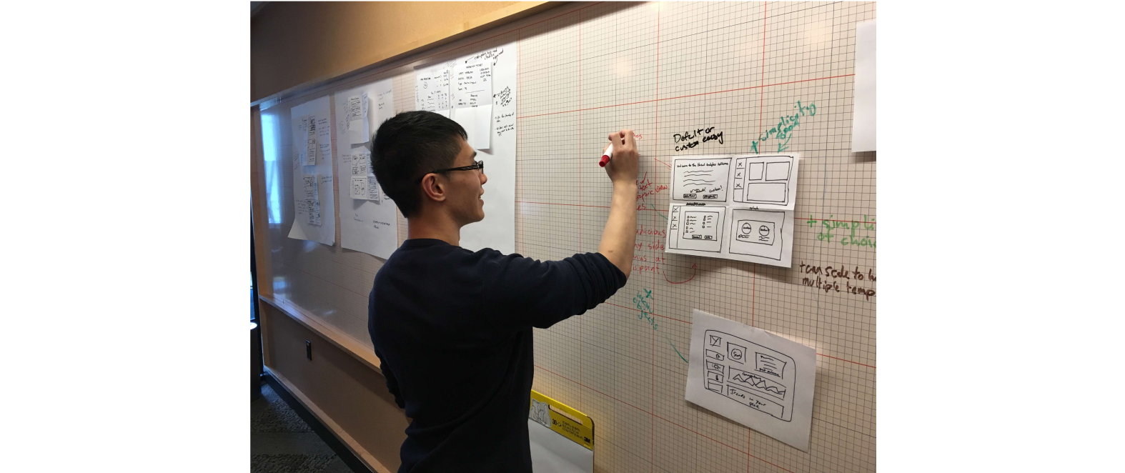
Design Studio
I facilitated a design studio session with our client stakeholders to brainstorm design ideas. In addition, we also discussed about their challenges, goals, and vision of the product.
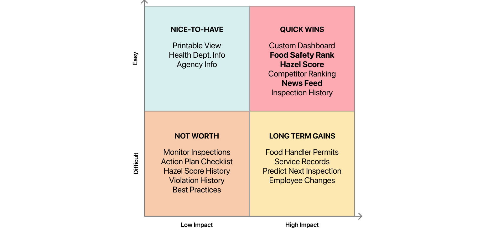
Feature Prioritization
I conducted a feature prioritization matrix to prioritize what to include in the prototype. Due to time constraints, we could not cover all possible features, so we decided to focus on features that were low effort and essential to our user's needs.
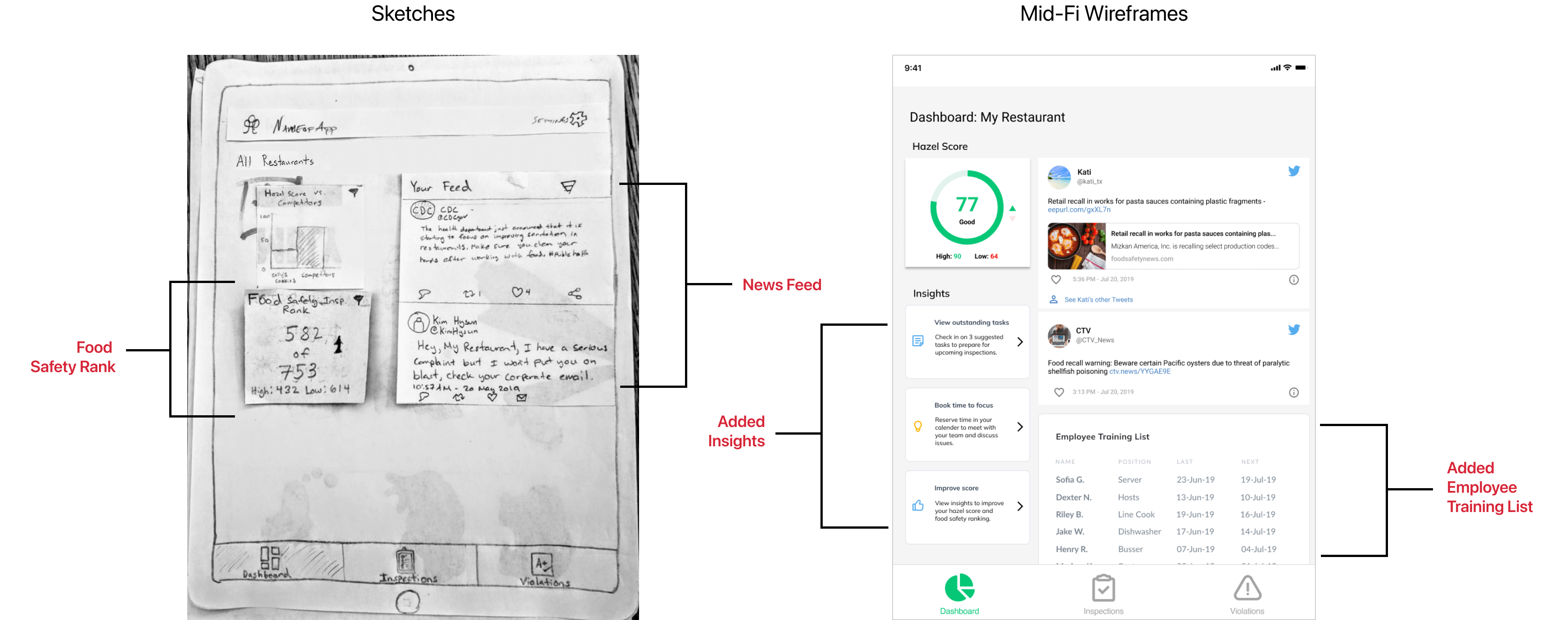
Wireframes
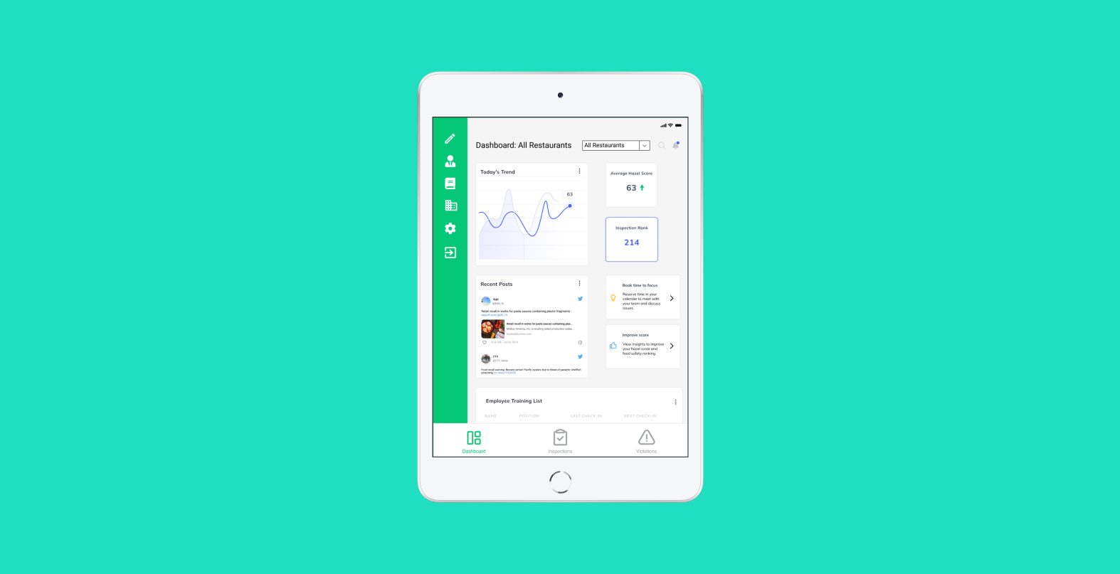
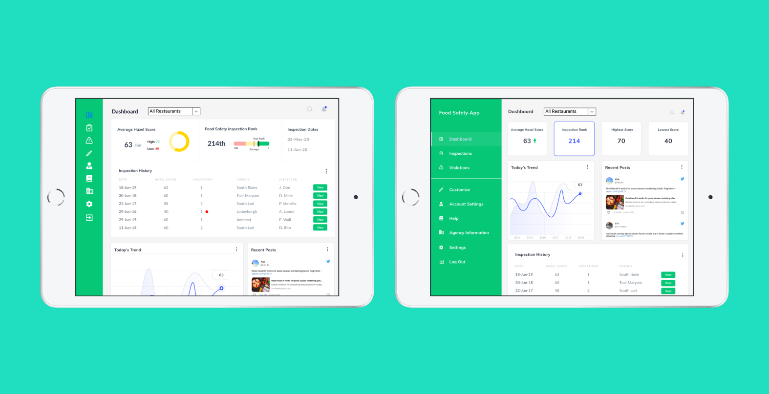
I added a news feed feature so users get notified of new rules, restrictions, and food recalls. In the next iteration, I also added the insights feature to include goals and tasks. Lastly, I included an employee training list to ensure employees are trained.
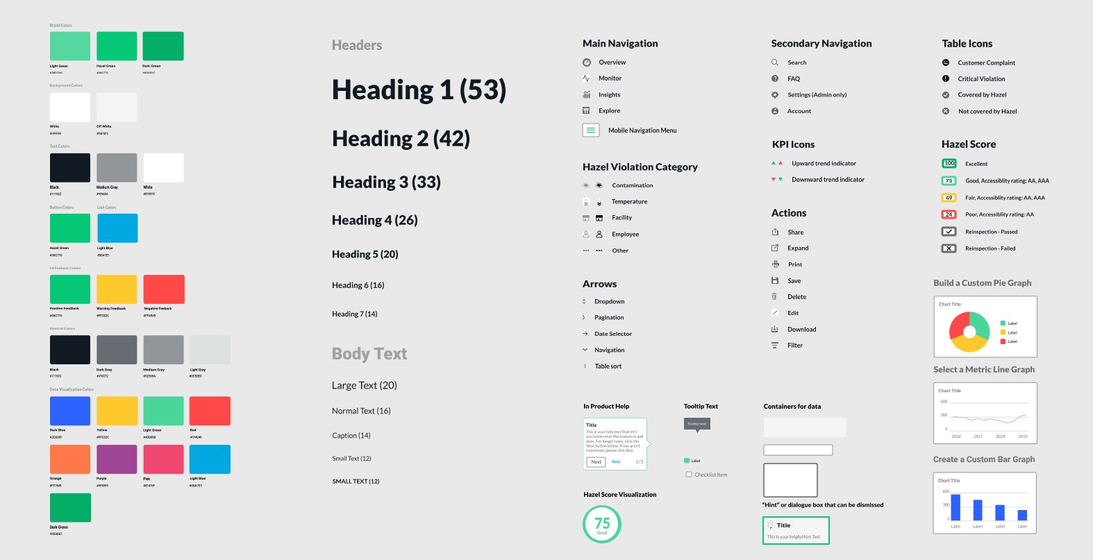
Design System & Style Guide
All designs that I created were based on our client's design system, design principles, and style guide. These include using navigational components and colors to help orient the user and focus the user's attention.
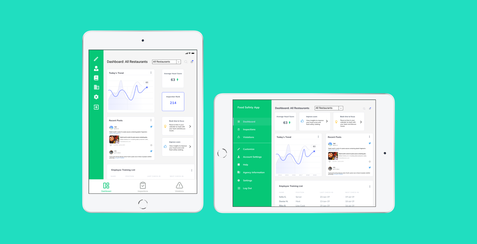
High Fidelity Screens
In the final prototype, I made changes to how information was presented to the user in order to make it more intuitive and less overwhelming. These changes included visual cues for better validation and tool tips to make information easily more digestible.