Fractal Link
Share computer resources with others from your home.
Project Overview
Fractal Link is a desktop application that allows users to safely publish websites, services, and applications from the convenience of their home. I led user research & design and crafted multiple wireframes and design system components for the landing page and demo feature.
Role
UX/UI Designer
Timeline
4 Months
Tools
Zoom, Adobe XD, Figma
Process
Discovery, Exploration, Testing
The Problem
The goal of Fractal Link is to provide an alternative to hosting that is affordable and accessible to everyone. How do we create an experience that caters to both new and advanced users that isn't confusing or frustrating?
The Solution
We believe creating a good landing page for Fractal Link's product will create a pleasant and intuitive experience. We will know this to be true when we see an increase in satisfaction and ratings.
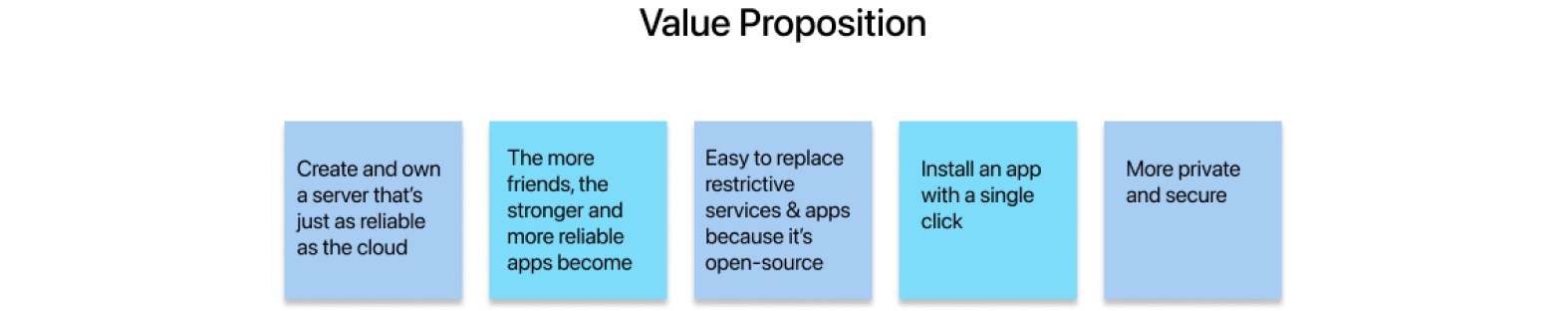

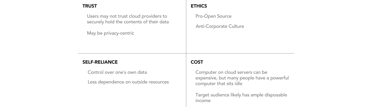
Stakeholder Interview
I conducted an interview with the founder to learn more about his vision and the value proposition of Fractal Link's product. From the interview, he identified the benefits of the product.
Competitive Analysis
I conducted competitive analysis with twelve competitors to discover how they stay competitive. I discovered that most companies that support self-hosting use centralized data systems and architecture. In addition, most competitors have a clean and simple interface and a demo feature.

User Interviews & Surveys
I sent out surveys on social media and conducted interviews to understand the target audience's feelings and motivations. From this I identified the primary reasons and motivations users would want to self-host.
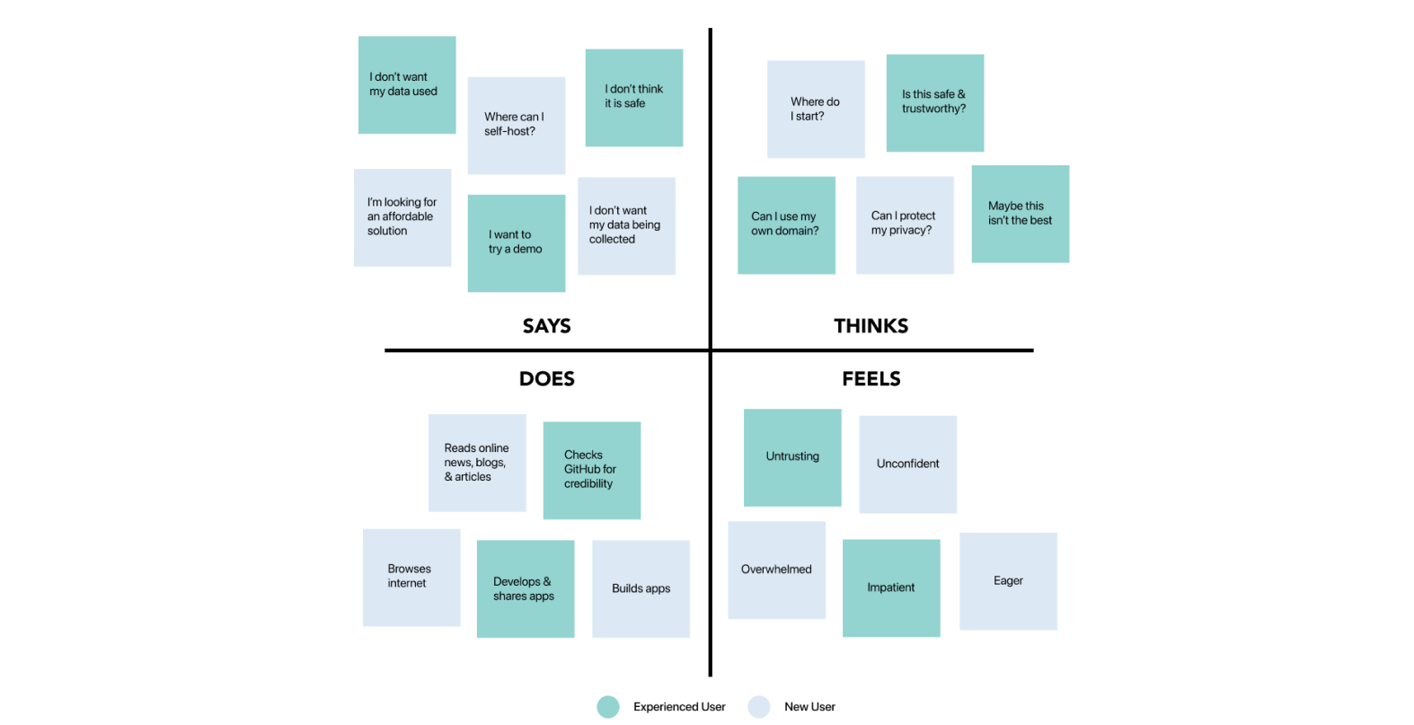
User Empathy Map
I created a user empathy map to gain a deeper insight about our audience's needs and pain points. From this I identified two different types of target users.
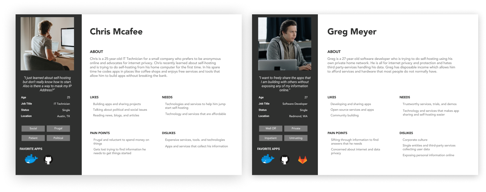
Persona Development
I crafted two different peronas from the user empathy map who represent our model users. Chris and Greg represent the new and experienced user respectively.
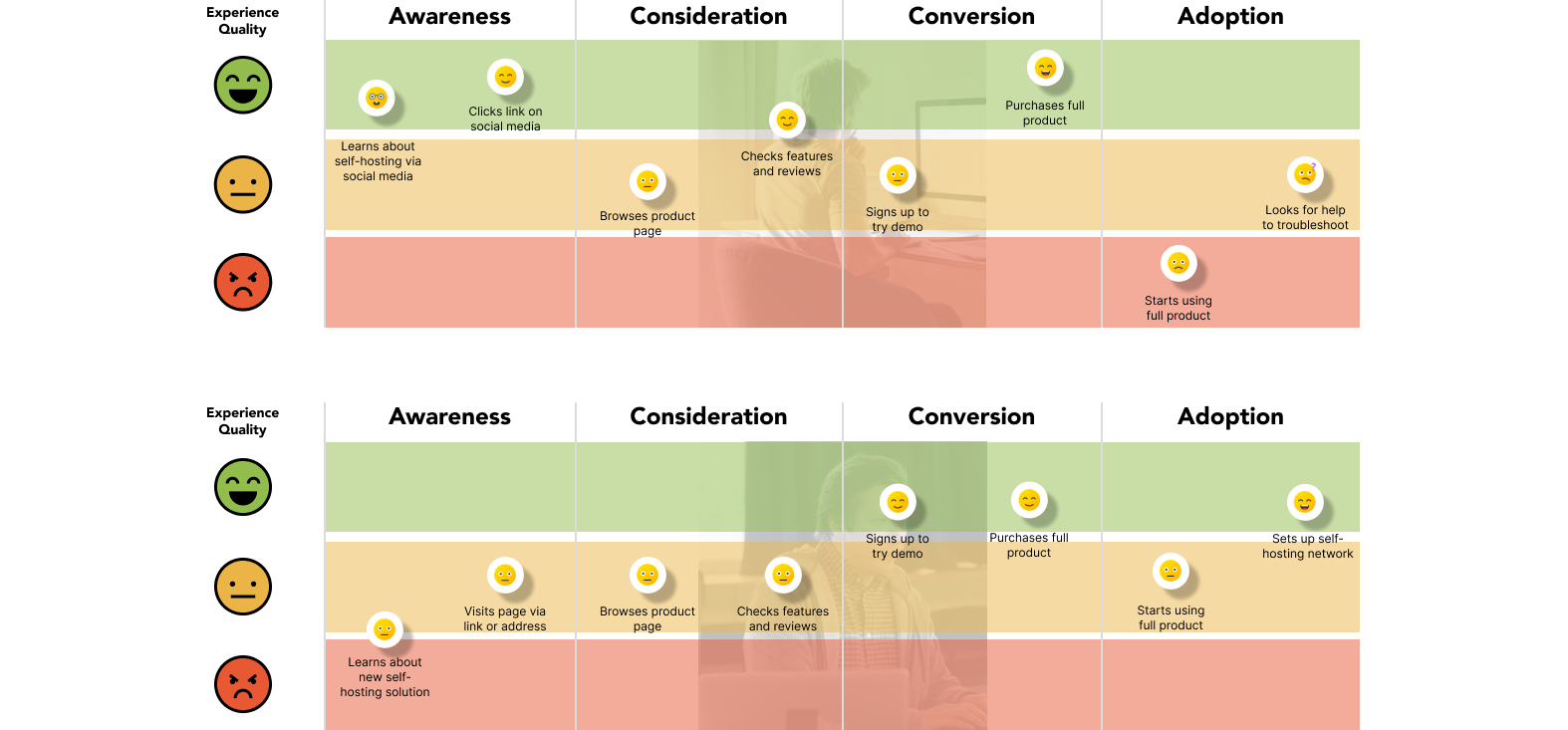
User Journeys
Because both model users represent two types of people who would be using the product, I created two different user journeys. The user journey mapped out both user's anticipated behavior and experience.
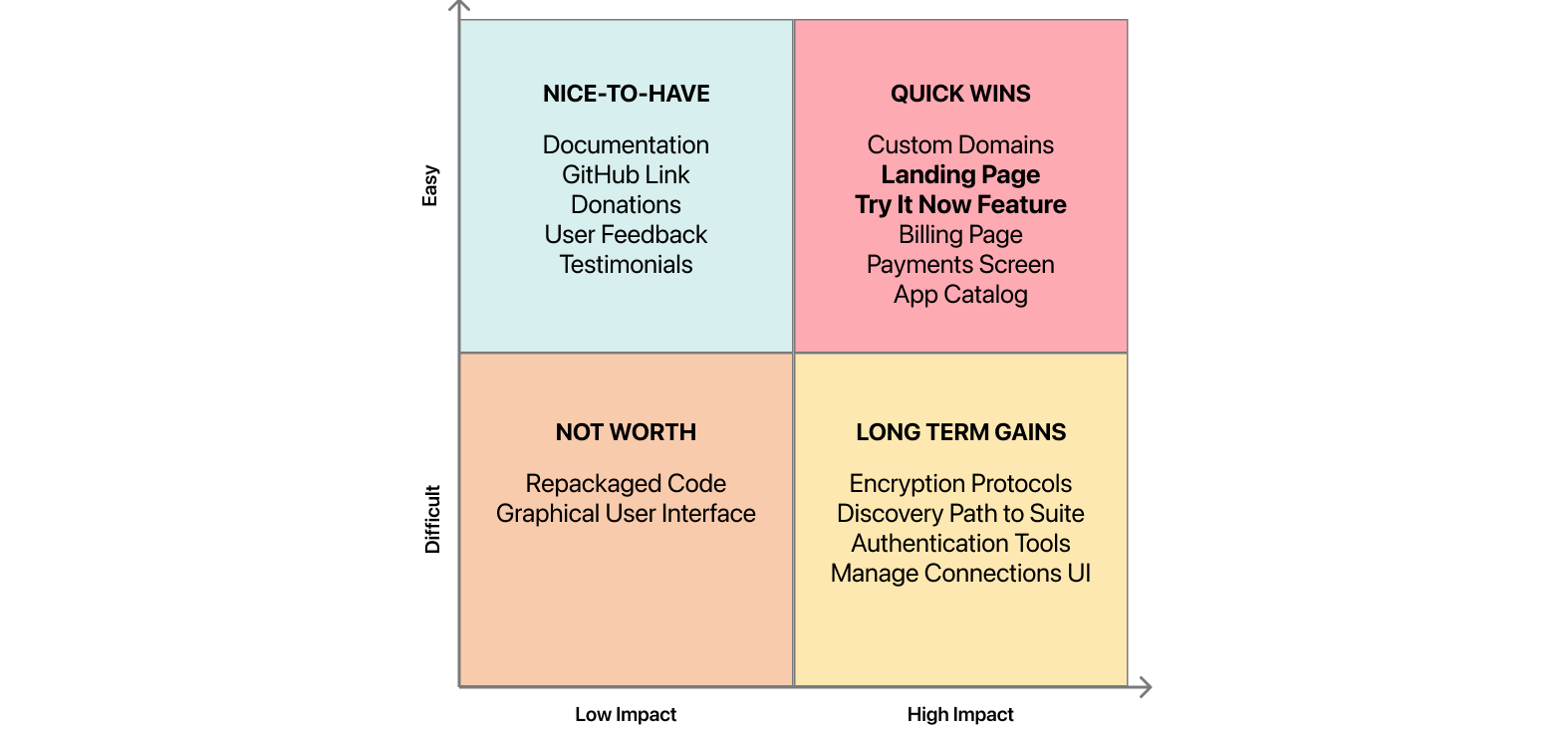
Feature Prioritization
I led a feature prioritization exercise with the team and then voted on which quadrant and features were worth investing first. The landing page serves as the base for people to try and learn about the Fractal Link product.
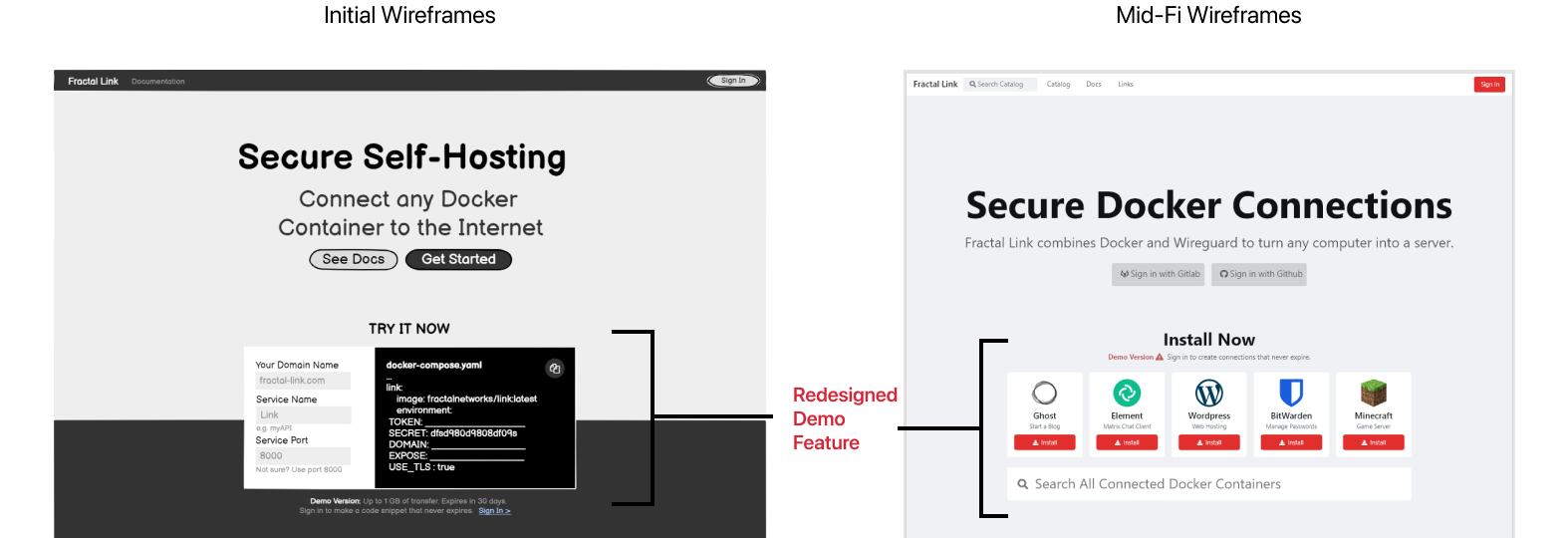
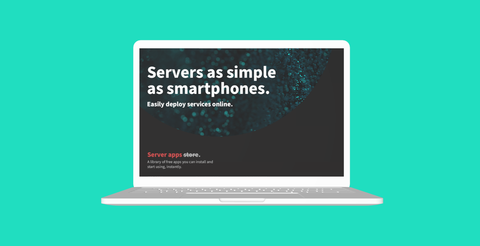
Wireframes
Early designs of the landing page included a demo feature that prompted user input. Because new users were confused with how to use it, it became an install file in the next iteration for simplicity.
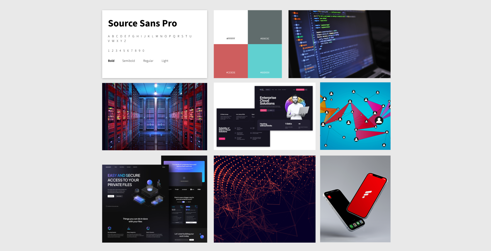
Mood Board
Our team explored a variety of familiar color palettes and design patterns from competitor platforms, social media, and online imagery to establish brand identity and create assets for the style guide.
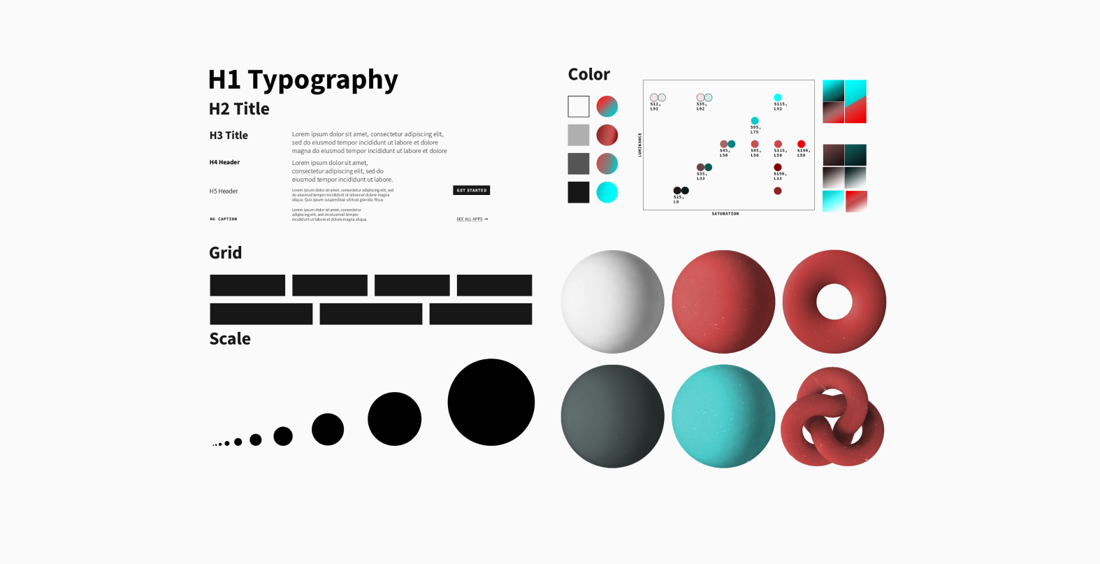
Style Guide
My team developed a style guide from our research, mood board, and visual assets. These style guidelines would be incorporated in our high fidelity designs.
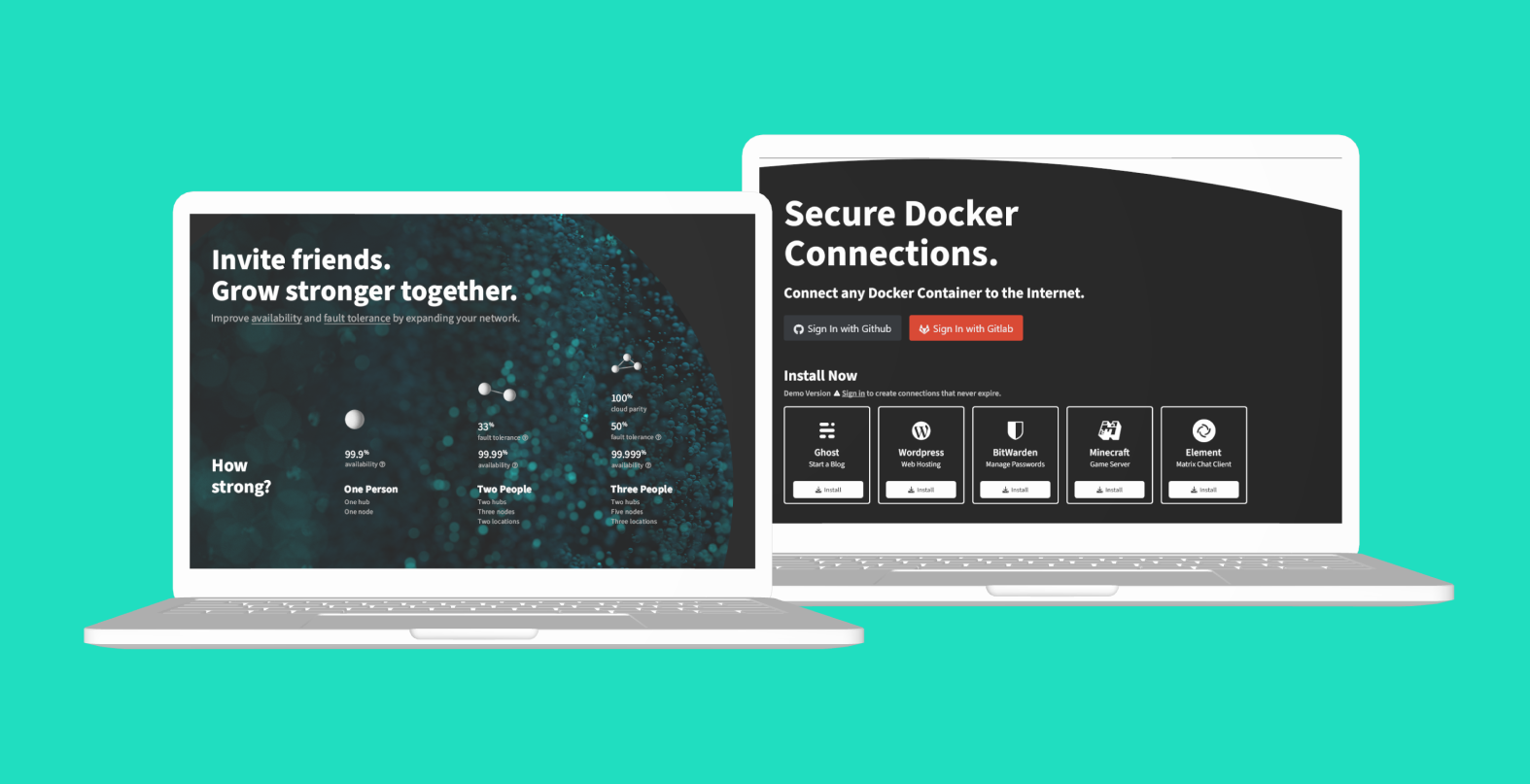
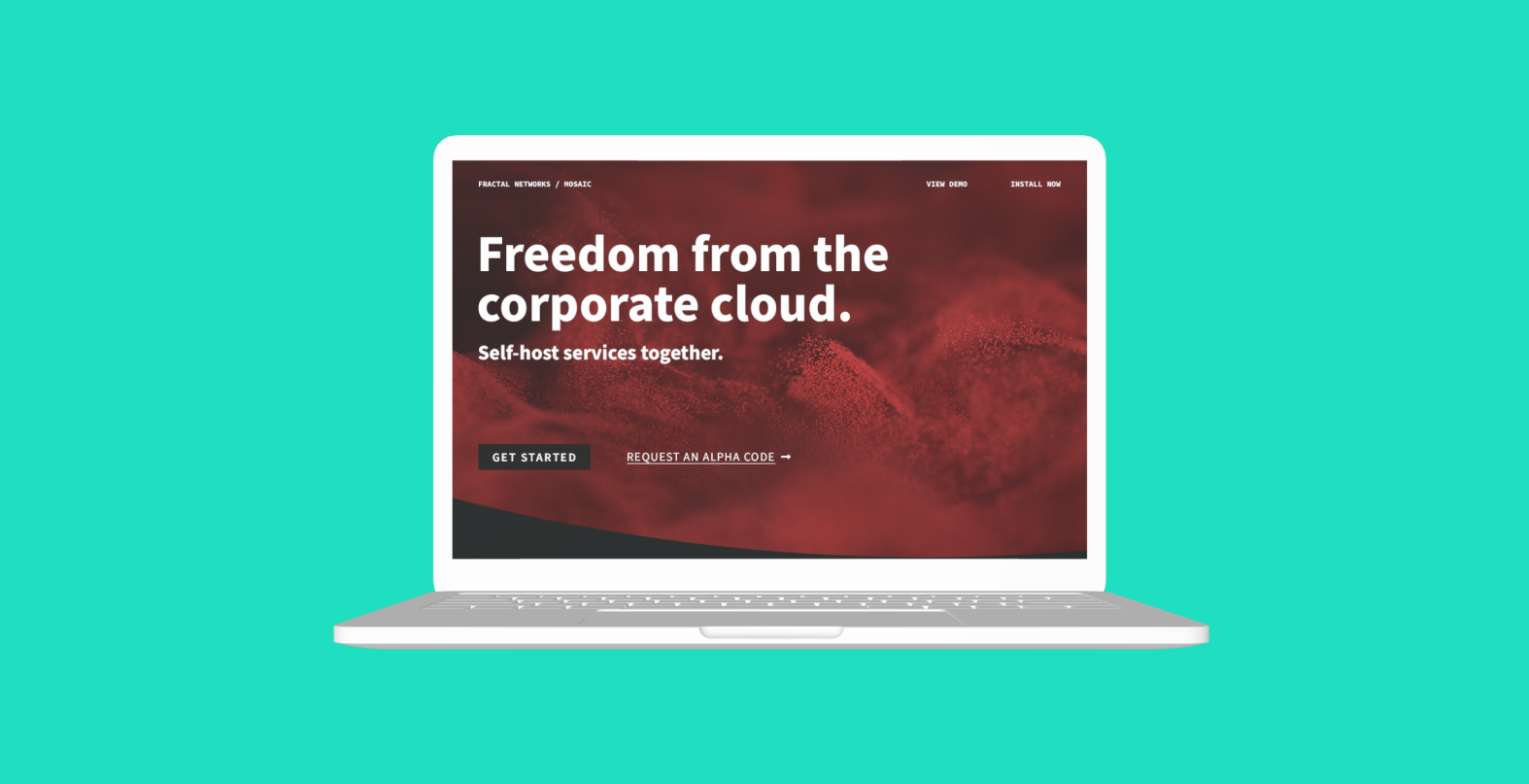
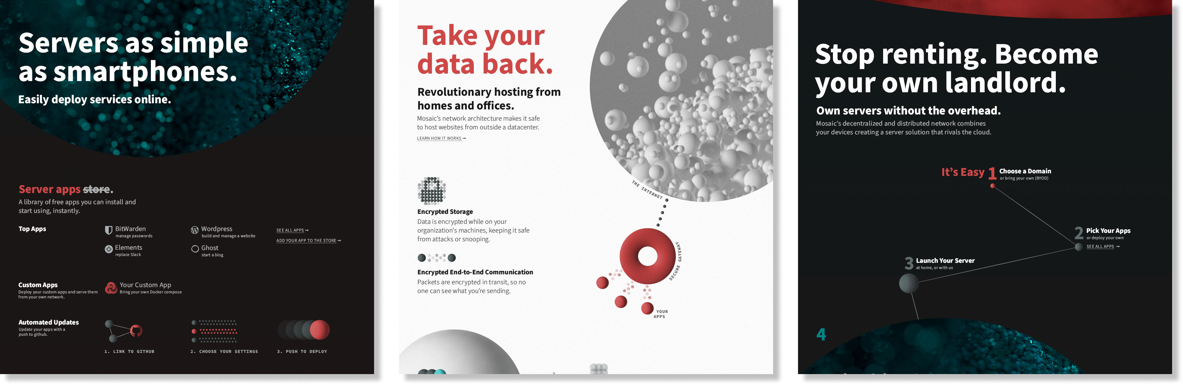
High Fidelity Screens
Our team followed style guidelines to create high fidelity designs of the landing page to establish trust with users. In addition, our team produced digital advertisements, visual assets, marketing materials, logos, and promotional and informational resources to establish brand identity.